

In a rush? Click here to read a short summary of this article
Introduction:
Why do companies decide to re-brand their packaging? In this Brief we consider why and when companies choose to re-brand, the aims of re-branding, and how it can impact the consumer.
Key takeaways:
- Health and environmental impact: Redsmith Distillery launched gin bottles made from 100% recycled glass and reportedly 20% lighter than its previous bottles; Tropicana updated its Kids Smoothies range to display ‘1 of 5 a day’ and ‘no added sugar’ on pack to appeal to parents.
- Influencing consumer behaviour: companies need to balance maintaining consumer confidence and refreshing their image. A “misaligned rebranding can lead to confusion and loss of trust” (brand designer Simona Cellar).
- Brand identity: Free the Birds worked with Avon to update its packaging design and create a new ‘female-positive’ visual identity; PizzaExpress and BRANDON updated the restaurant’s packaging design, brand architecture and identity.
- Successfully re-branding: The main reasons for re-branding include outdated image, targeting new audiences and business mergers. A successful re-brand can increase brand recognition and competitor differentiation but consumer testing is important, as risks include negative public reaction and brand confusion.
Conclusion:
A successful re-brand will see “an immediate and impactful rise in consumer purchase intent” (Siena Dexter, Naked Ape Brands). New ventures have increased and investment in existing ventures has reduced, with a drive towards luxury at a time of cost-cutting. Research is key, but leaning too far into data loses the excitement that results in returning customers.
Dexter concludes: “Rebrand success has to exist in a perfect storm of exciting and expected.”
In this edition of The Brief, we look at re-branding in packaging: why and when companies choose to re-brand, the aims of re-branding, and how it can impact the consumer.
When companies decide to re-brand, they may have multiple reasons for doing so, such as reaching a new audience, updating a product’s imagery, or drawing consumers’ attention to more ‘healthy’ or ‘environmentally friendly’ elements.
Health and environmental impact
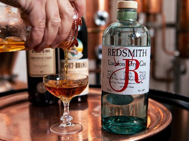
For example, last year Redsmith Distillery launched its gin bottles made from 100% recycled glass and reportedly 20% lighter than its previous bottles. The company claimed the new packs use less energy to manufacture, handle and ship, and their recycled nature “reduces environmental impact”. It added that the bottles have a natural cork stopper with a wooden top, sealed with a recyclable shrink closure.
Redsmith also overhauled the brand, with the label re-designed in-house with the stylised ‘R’ for Redsmith standing out on the front of the label. A tiny representation of the original Redsmith bottle is also on the label, and each has a handwritten batch and bottle number, signed by the distiller.
In September 2023, STORMBRANDS developed a new packaging system and updated the branding for Tropicana’s Kids Smoothies range, intending to appeal to both children and parents. The beverage brand required a ‘fun, reassuring and distinctive’ brand and packaging identity, involving balancing gestures towards ingredient quality, nutrition, and sustainability for adult consumers with an engaging design for kids.
As a result, in the updated design photographs of real fruits are printed on the outer carton with credentials such as ‘1 of 5 a day’, ‘no added sugar’, and ‘boosted with vitamin C’. This is expected to appeal to parents as the primary consumer of the multipack boxes by signifying the pack’s natural ingredients. At the same time, Tropicana says ‘personality-led’ messaging and fun facts such as ‘mandarins can get sunburnt’ and ‘a pineapple is actually a berry’ seek to prompt conversations amongst children at lunchtime.
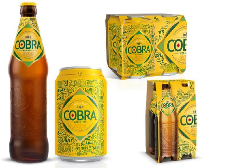
Earlier in the year, Cobra Beer underwent a visual rebrand for its entire range, aiming to connect the drink with Pan-Asian cuisine and cater to increasing consumer interest in spicy cuisine. Intended to accompany dishes including Indian, Vietnamese, Chinese, Thai, Japanese and other spicy foods, the new artwork reads: ‘Where There’s Spice, There’s Cobra.’
What are brands hoping to achieve with these kinds of changes? In Redsmith’s case, drawing attention to the recycled content of the bottle looks to be appealing to consumer awareness and interest in products said to be more environmentally friendly or sustainable. As part of its Sustainable Consumer 2023 study, professional services firm Deloitte UK found that one in four consumers (26%) are prepared to pay more to protect biodiversity or for sustainable products and packaging (24%) – however, it also found that when considering a purchase, most customers value durability (58%), followed by repairability (39%) and biodiversity (37%) over recyclability or biodegradability.
In Cobra’s case, the company stated that in a survey it carried out among 2000 respondents, over half of 18-to-34-year-olds reported that they are ‘adventurous’ when it comes to trying new cuisines and add spice to most of their savoury meals. Due to this feedback, it says the new style is derived from graffiti to appeal to ‘urban foodies’ in search of a premium brand.
Influencing consumer behaviour
How can re-branding packaging influence consumer behaviour? In a LinkedIn article, senior brand designer Simona Cellar gave her view. She described her tendency to stick to her ‘main go-to products’ in stores, as familiarity makes them easy to locate and the overall shopping experience less complicated. However, she pointed out that a discontinued item or re-brand gave her pause – with a re-brand resulting in mixed feelings.
She believes the main factors of re-branding success and failure are the following: evoking perception shifts; the power of familiarity and coherence; and unmet consumer expectations.
In terms of perception shift, she gave the example of cashew nuts packaging, stating its success was due to modernizing its logo, displaying the product in a larger size and positioning the product as healthy and more sophisticated through the use of brown colours and matte plastic. She said the previous design was “generic and inexpensive”, causing her to feel “indifferent” when buying the product.
Cellar adds that an effective packaging re-brand “strikes a delicate balance between familiarity and evolution”, as a complete overhaul risks alienating loyal customers -retaining elements of the old packaging creates a sense of continuity. On the other hand, she points out, “a misaligned rebranding can lead to confusion and loss of trust.”
How can brands strike a balance between maintaining consumer confidence in a brand and refreshing its image? To learn more about this, we spoke to Matt Baldock, business development director, Digital Packaging EMEA at SEE (formerly Sealed Air).
He stated that while re-branding allows for influencing brand recognition, recall and reinforces the brand’s relevance in today’s world, it also has the power to alienate consumers if the branding is too radically different from what consumers are accustomed to. He says that re-branding reasons can range from reflecting new leadership and increasing in-category differentiation to global expansion - with a recent trend in continuous changing of on-pack messaging to reflect a cause or mission.
Baldock also highlighted “reactive marketing” which he states has transcended from social media to packaging. He underlined the importance of research for companies considering a re-brand, as it can be completed quickly with “many digital tools that can access customer panels, run market data analyses and advise on strategic direction based on that.”
When developing packaging designs with companies at SEE, he says the company believes in “democratising the development process” and utilising digital tools before asking someone to take the risk and fully launch a new brand. The process includes some visuals and digital prototyping before moving onto physical prototypes when the brands want to pitch or demonstrate their products.
Currently, Baldock sees a lot of strong colours coming back into re-branding, after a few years of more “natural” aesthetics. One reason for this could be materials becoming more sustainable, meaning “the brands don’t have to try to ‘appear’ sustainable anymore” – and although bold colours are used, the branding elements are becoming simpler.
Brand identity
One of the reasons for a company re-branding is a change of brand identity, including visual and packaging design. For example, Avon worked with creative agency Free The Birds to update its packaging design and create a new ‘female-positive’ visual identity to match its new brand positioning.
Apparently, an audit of Avon’s global positioning revealed the brand’s identity had become inconsistent between different platforms. In addition to upgrading Avon’s packaging design, a new hallmark logo, website and social media assets were created.
The hallmark is positioned in a plinth shape with an ‘iconic power pink’ colour, aiming to reflect the company’s previous ties to breast cancer awareness and aspire towards optimism, boldness and mobilization.
The re-branding campaign was rolled out across Europe, the Middle East & Africa, South and North Latin America, and Asia Pacific territories.
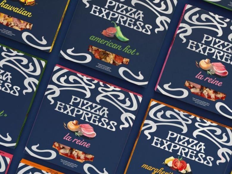
Another example is PizzaExpress’ updated packaging design and visual identity. The restaurant chain worked with creative partnership BRANDON to come up with a new packaging design, brand architecture and Masterbrand identity for its chilled pizzas, hoping to expand the range of occasions on which its products are eaten.
Three range tiers were developed from PizzaExpress’ portfolio of Icons (American, Margherita, Sloppy Giuseppe) and Restaurant Favourites (La Reine, American Hot, Hawaiian, Margherita Formaggi, Pollo American, Pollo ad Astra), separated by colour.
The filigree logotype was revamped by lettering artist Dan Forster, intended to capture the aura of the first PizzaExpress and make use of the cusps and shapes of the original brand asset while improving legibility at speed.
What makes a successful re-brand?
In an article on brand agency SmashBrand’s website, director of content and marketing Jason Vaught outlines the reasons for rebranding, the benefits and the risks. According to Vaught, the main reasons for a rebrand include outdated image, poor reception or performance, targeting new audiences, and mergers and acquisitions.
When it comes to the benefits, he highlights competitor differentiation, increased brand recognition and optimizing for purchase intent – but also points out risks such as alienating the brand’s existing customers, negative public reaction and brand confusion. Vaught states:
“Successful packaging speaks to the target consumer and conveys brand values through visuals and text.”
He draws attention to the importance of consumer testing and presenting design concepts to a select group of consumers to gather reactions and preferences. He maintains that the best method is ‘simulated package design testing’, as “the unbiased feedback obtained is crucial in understanding consumer perception of the design elements, such as colour schemes, imagery, and overall appeal.”
To understand more about re-branding from a brand agency perspective, we spoke to Siena Dexter, co-founder and strategy director at Naked Ape Brands. When a company decides to re-brand, one reason can be to join new market. “Getting into grocery is a pivotal point for any consumer packaged goods (CPG) brand,” she says, adding that the Covid years saw a boom in direct-to-consumer (D2C) brands – but recent years have seen a move towards returning to grocery.
When it comes to consumer perception, a successful re-brand will see “an immediate and impactful rise in consumer purchase intent,” Dexter says. Naked Ape often uses elements of anthropology and semiotics in its work with brands.
Dexter gave the example of working with a luxury brand on a lab-grown solution to traditional mined diamonds – “we had to first understand what the concept of ‘diamond’ holds in the minds of consumers,” she states, adding that diamonds are presented as “a symbol of ownership over a woman, but also a way for women to feel desired and for men to be desired. Our job was to understand consumer perception of luxury goods and it’s that’s changing in the context of the current zeitgeist.”
Recently, Dexter reckons new ventures have increased and investment in existing ventures has reduced; there’s a drive towards luxury - at a time of cost-cutting, she emphasises – meanwhile ROI – “measurable, tangible, reliable metrics are valued over creative expertise.” While research is key when predicting the success of creative work, leaning too far into data loses the “intangible, tug at the heartstrings excitement” that results in returning customers.
“Choosing vegan over plant-based or saying ‘patty’ over alt-protein burger isn’t going to make the kind of difference that goes the distance,” Dexter states.
She also underlined that re-brands predominantly happen after a turnover of 1-3 million, and/or when stakeholders are involved. The biggest consideration with a re-brand is understanding what you’re selling and why it’s important, she points out - that success at point of sale (POS) relies on visual cues and language that show clear differentiation from existing options, while “still living in the realms of acceptable”. Having said that, she highlighted that cans of water that look like beer (Liquid Death, for example) have been “flying off the shelves”. Ultimately, she concludes:
“Rebrand success has to exist in a perfect storm of exciting and expected.”
If you liked this story, you might also enjoy:
How are the top brands progressing on packaging sustainability?
The ultimate guide to global plastic sustainability regulation
Sponsored stories

How ATS-Tanner’s banding solutions align with the new PPWR
ATS-Tanner’s banding solutions aim to reduce packaging waste, provide a practical alternative to plastic and improve recyclability. In

How Rollon’s linear systems provide reliability for tertiary packaging
Rollon believes tertiary packaging machinery must perform without fail, showcased by its recent partnership with AMP Automation to develop palletizing

Discover what’s new at London Packaging Week
Packaging has never carried greater commercial responsibility. It influences how consumers perceive brands, how products perform in increasingly competitive markets

Paperworld Middle East partners with FSC to champion responsible sourcing across the region’s paper and stationery industry
Paperworld Middle East, the region’s leading trade show for paper and stationery products, taking place from 13–15 October

Made for Life: How Sappi reveals what trees make possible
What connects an experienced papermaker, the creators of cactus-based leather, the people conserving forests for future generations, and a

The advantages of all-electric adhesive dispensing in modern packaging
Packaging manufacturers are under constant pressure to increase output, reduce operating costs, improve sustainability, and maintain consistent product quality. One

YUTO won 12 international packaging design awards across three global competitions
Driven by the global sustainability trend, the EU PPWR mandates packaging reduction, recyclable design, and restrictions on single-use packaging.

How rPS Food aims to bring circularity to polystyrene packaging
In this edition of the Spotlight, Coexpan (part of Grupo Lantero) details how its rPS Food enables up to 100%
Read next


Nemera launches bi-dose nasal spray solution
Drug delivery device company Nemera has announced its DuoSpray bi-dose nasal spray platform, a ‘non-invasive, needle free’ administration

Coveris develops mono-material sleeve with 30% less material for Dr Beckmann
Coveris has unveiled its mono-material sleeve solution developed for Dr Beckmann, said to use around 30% less material than

Sustainability Awards 2026 Finalist Interview: Prevented Ocean Plastic’s project for food-safe recycled PP
Prevented Ocean Plastic is a finalist in this year’s Sustainability Awards with its project seeking to recycle polypropylene (PP)