
PPWR Compliance Starts on the Factory Floor: Why Packaging Data is the Missing Piece
About the webinar PPWR is not just introducing new packaging requirements. It is raising the importance of accurate, traceable and

In this edition of the Brief, we look at how different colours are utilized in packaging, the role of colour theory in packaging design, which colours consumers are most drawn to and why. We also note the role of cultural contexts in colour association.
Introduction:
In this edition of the Brief, we look at how different colours are utilized in packaging, the role of colour theory in packaging design, which colours consumers are most drawn to and why.
Key takeaways:
A GWP Group article references a lab experiment where ‘warm’ packaging colours such as reds and oranges increased consumer’s expectations for taste and indulgence, while ‘cool’ colours like blues and greens led people to ascribe more healthiness or sustainability to the same products.
Colour associations are not universal – article author Jay Daggar warns that red could “stimulate appetite in one market” but “evoke caution or danger” in another.
There can be issues with using green in packaging design, given its use in ‘greenwashing’. Daggar says using green “demands authenticity” and can imply freshness or sustainability in food categories, but may conflict with consumer expectations of flavour in some product types.
Blue is reportedly “one of the safest, most trusted colours in packaging and branding”, conveying stability, reliability, intelligence, and calm, leading many financial, tech, healthcare, and pharmaceutical brands to adopt blue as a primary brand colour.
Design studio Noramble’s article on colour theory in packaging design notes that a shift towards eco-consciousness has led to a rise in products packaged in greens and browns, perceived as more sustainable, and tech brands using bright blues and oranges can appear more “cutting-edge and innovative”.
A study on the effect of packaging colour on consumer product experience in the food and beverage and home and personal care categories revealed that colour affects customers on a physiological, associational and cultural level. The associational level refers to packaging colours that have become linked with a brand image or product category, through consumers interacting with it in the marketplace over an extended period of time.
Conclusion:
The study concludes colour is “perhaps the single most important element (or feature) as far as the design of multi-sensory product packaging is concerned”, playing a dominant role in capturing the attention of the shopper in the aisle or online, and distinctive colours (and colour schemes) can also act as a valuable brand asset.
How can the psychology of packaging colours affect a product’s success? In an article from GWP Group, Jay Daggar references a lab experiment where ‘warm’ packaging colours such as reds and oranges increased consumer’s expectations for taste and indulgence, while ‘cool’ colours like blues and greens led people to ascribe more healthiness or sustainability to the same products - although the cool colours also diminished perceived “tastiness” in some cases.
However, Daggar notes that colour associations are not universal; what resonates with younger consumers might miss the mark with older ones, and cultural contexts can shift meaning. He gives the example of how red could stimulate appetite in one market but evoke caution or danger in another.
When to comes to making your packaging stand out to the consumer, Daggar suggests a controlled set of colours (two or three complementary or contrasting hues) to maintain clarity and avoid conflicting signals. He also recommends testing the colour combinations in real-world lighting and formats, as colours that perform well on screen may behave differently on printed materials or when seen against in-store lighting.
Considering specific colours, Daggar notes that red is often used by lifestyle, entertainment and snack brands as “brighter, almost neon reds read as youthful and energetic, whereas deeper reds (such as burgundy or wine) can feel more premium and elegant.” Another point to consider is the legibility of text or graphics on red, as they need high contrast to remain readable.
Pure yellow packaging is often skewed toward younger audiences, targeting children and teens, but mixed palettes can broaden appeal. Daggar notes that that this colour is especially common in fast food, delivery, and marketing-focused retail packaging.
There can be issues when it comes to using green in packaging design, especially given its use in ‘greenwashing’, when brands “overpromise environmental credentials through colour alone without backing it up with real sustainability practices,” says Daggar. He states that using green “demands authenticity” and can imply freshness or sustainability in food categories, but may conflict with consumer expectations of flavour in some product types.
Blue is reportedly “one of the safest, most trusted colours in packaging and branding”, conveying stability, reliability, intelligence, and calm. For this reason, many financial, tech, healthcare, and pharmaceutical brands adopt blue as a primary brand colour.
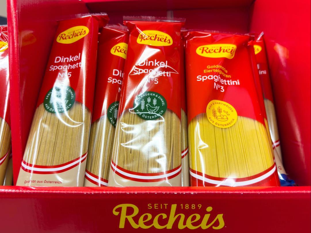
Taking a closer look at how colour use can impact consumer perception, design studio Noramble published an article on colour theory in packaging design. The article notes that black is often associated with sophistication, luxury, and power and is ideal for “high-end products offering a sleek and modern appeal”. White is often associated with purity, simplicity, and cleanliness, and is often used in minimalist designs to convey a sense of purity and efficiency.
The company notes that a shift towards eco-consciousness has led to a rise in products packaged in greens and browns, which are perceived as more sustainable, and tech brands using bright blues and oranges can appear more “cutting-edge and innovative” in packaging design. To illustrate this, Noramble highlights Method’s cleaning products, which utilize a palette of greens and natural tones to emphasize their eco-friendly and non-toxic qualities. This colour choice aligns with the brand’s message and appeals to environmentally conscious consumers.
The studio also gives an example of its own work developing a design strategy for Zingara’s canned soda. It conceptualized a series of design directions celebrating spontaneity, adventure, and sensory delight by using “bold colours, dynamic typography and playful illustrative fruit mascots”. Noramble adds that the colour palette was selected to reflect the brand’s “energetic and lively” personality, with each soda flavour paired with a specific set of colours to make it easily identifiable and visually represent the taste.

U.S. printing company Newprint published a blog post considering the role of colour in packaging branding and marketing. Commenting on the effect of certain colours when used in packaging, the post states that:
“Purple relates to indulgence and luxury, extravagance, uniqueness and premium quality. It is a royal colour, so it evokes elegance and prestige. Purple packaging colour attracts females more than males, but it is becoming more universally accepted.”
To add to this, Newprint says that brown is an “earthy and relaxing” colour but can also represent strength and reliability. It is often associated with homely, comfortable, organic and wholesome products.
Is there a scientific basis behind consumers’ perception of packaging, based on the colours used? A study authored by Charles Spence and Carlos Velasco would indicate that there is.
Focusing on the effects of packaging colour on consumer behaviour and product experience in the food and beverage and home and personal care categories, it states that colour is often used to convey information to the consumer about a product’s sensory properties (such as taste or flavour) or to prime more abstract brand attributes (such as premium, natural, or healthy).
However, it adds that packaging colour can also affect the customer’s product experience as well:
“A growing body of empirical research now shows that packaging colour affects everything from the expected and perceived taste and flavour of food and beverage products through to the fragrance of home and personal care items. Packaging colour, then, plays a dominant role at several stages of the consumer’s product experience.”
Referencing studies by Hine (1995), Kaiser (1984), Kido (2000), Moller et al., (2009), Sacharow (1970) and Wheatley (1973), the authors say that colour affects the customer in three different and interrelated ways: the physiological, the associational, and the cultural. The associational level refers to packaging colours that have become linked with a brand image or a specific product category, through consumers having interacted with it in the marketplace over an extended period of time.
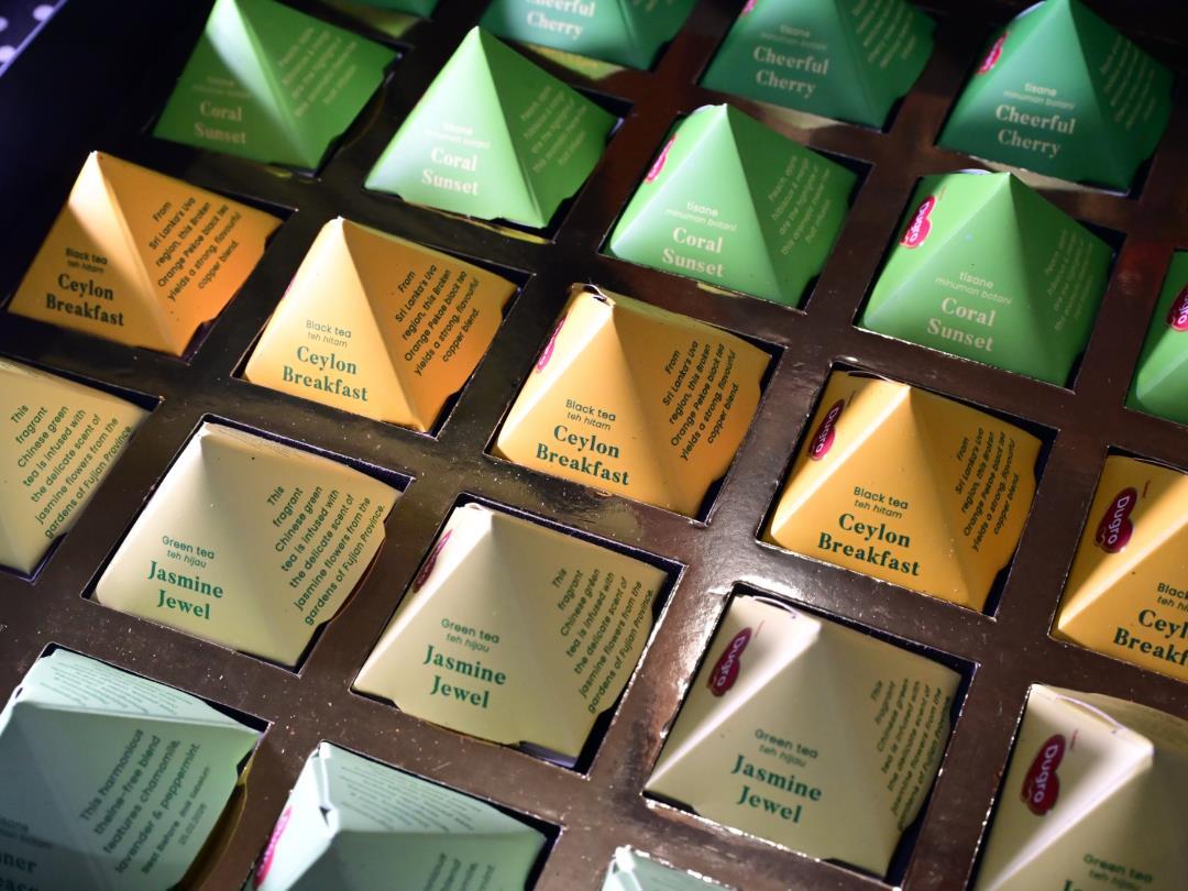
Spence and Velasco note that the challenge facing many companies (and the design agencies who deliver their product packaging) concerns how to use packaging colour to convey the right impression at the various different moments of interaction with a product (sometimes referred to as the ‘moments of truth’ Louw and Kimber (2011), Salgado-Montejo et al. (2017). They add that companies may succeed at ‘the first moment of truth’ by changing their packaging colour in order to increase shelf stand-out, only to fail at the second ‘moment of truth’, when their consumers report that their experience and/or perception of the product has also changed.
The authors comment that from a cognitive neuroscience perspective this makes sense, given that consumers are visually-dominant, and “what they see typically automatically sets expectations about a product’s likely sensory and hedonic properties.”
Ultimately, the study concludes colour is “perhaps the single most important element (or feature) as far as the design of multi-sensory product packaging is concerned.” It plays a dominant role in terms of capturing the attention of the shopper in the aisle or online, and distinctive colours (and colour schemes) can also act as a valuable brand asset.
If you liked this story, you might also enjoy:
The ultimate guide to packaging innovation in 2026
Packaging and Packaging Waste Regulation: what to know in 2026
Everything you need to know about global packaging sustainability regulation

ATS-Tanner’s banding solutions aim to reduce packaging waste, provide a practical alternative to plastic and improve recyclability. In

Rollon believes tertiary packaging machinery must perform without fail, showcased by its recent partnership with AMP Automation to develop palletizing

Packaging has never carried greater commercial responsibility. It influences how consumers perceive brands, how products perform in increasingly competitive markets

Paperworld Middle East, the region’s leading trade show for paper and stationery products, taking place from 13–15 October

What connects an experienced papermaker, the creators of cactus-based leather, the people conserving forests for future generations, and a

Packaging manufacturers are under constant pressure to increase output, reduce operating costs, improve sustainability, and maintain consistent product quality. One

Driven by the global sustainability trend, the EU PPWR mandates packaging reduction, recyclable design, and restrictions on single-use packaging.

In this edition of the Spotlight, Coexpan (part of Grupo Lantero) details how its rPS Food enables up to 100%

Drug delivery device company Nemera has announced its DuoSpray bi-dose nasal spray platform, a ‘non-invasive, needle free’ administration

Coveris has unveiled its mono-material sleeve solution developed for Dr Beckmann, said to use around 30% less material than

Prevented Ocean Plastic is a finalist in this year’s Sustainability Awards with its project seeking to recycle polypropylene (PP)

If PPWR forces us to rethink packaging anyway, why stop at compliance? Peter Stael, owner and partner at Across-Consult,